search

LEMON BLOG

Why Arcade-Style Gaming Interfaces Still Favour Dark Palettes

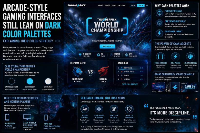
There is a reason arcade-inspired gaming interfaces keep returning to dark color schemes, and it goes far beyond visual style. Dark palettes are not just there to make a page feel dramatic or futuristic. In gaming design, they do real structural work. They help direct attention, simplify hierarchy, and create an immediate emotional reaction before the user has even read a headline.

Continue reading

Micro-Animations That Keep Users Hooked: What Gaming UI Understands That Most Apps Forget

Ever notice how a simple tap in a good mobile game feels weirdly satisfying? You press a button and it gives a tiny bounce. A menu slides in like it has weight. A wrong move triggers a subtle shake that says "nope" without yelling at you. None of that is random flair. It's deliberate feedback. And it's one of the biggest reasons games feel "alive" while a lot of everyday apps feel… stiff.

Continue reading

LEMON VIDEO CHANNELS

Step into a world where web design & development, gaming & retro gaming, and guitar covers & shredding collide! Whether you're looking for expert web development insights, nostalgic arcade action, or electrifying guitar solos, this is the place for you. Now also featuring content on TikTok, we’re bringing creativity, music, and tech straight to your screen. Subscribe and join the ride—because the future is bold, fun, and full of possibilities!

My TikTok Video Collection
Subscribe to our Blog
Get notified when there's new article
Subscribe