

Let's be honest for a moment. Most long-form content online isn't failing because people have short attention spans. It's failing because the reading experience itself is exhausting. Text stretches too wide, lines feel cramped, and layouts are built for quick scanning instead of real reading.
When that happens, readers don't just get bored. They give up. Articles get abandoned halfway through, ideas don't land, and trust slowly fades.
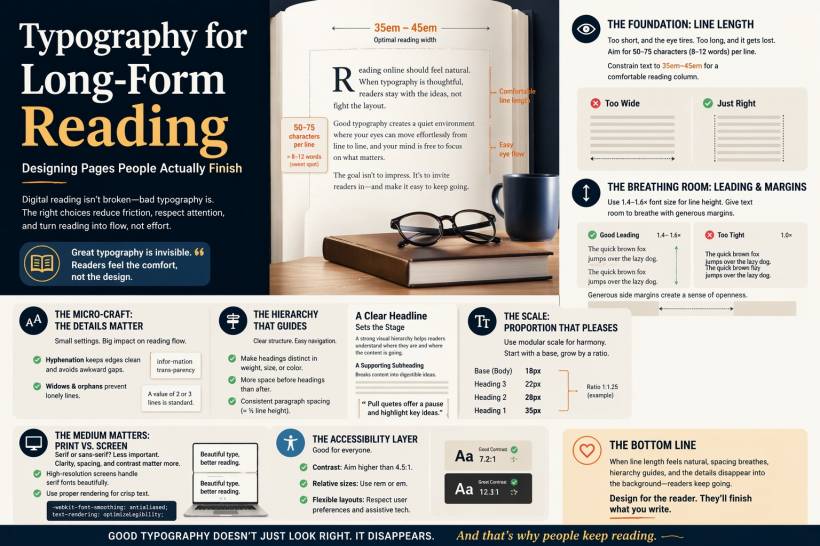
Good typography changes that completely. It doesn't just make things look nice. It makes reading feel natural. Effortless. Almost invisible. When done right, readers don't think about the design at all. They just keep going.
Here's what actually makes that happen.
Start With Line Length
If there's one thing that affects readability more than anything else, it's line length.
When lines are too short, your eyes constantly jump back to the start of the next line. It becomes tiring very quickly. On the other hand, when lines are too long, your eyes struggle to track across the page and find the next line without losing your place.
There's a sweet spot, and it's surprisingly consistent. Around 50 to 75 characters per line tends to work best. That usually translates to roughly 8 to 12 words per line in English.
On the web, this means you need to resist the temptation to let text stretch across the full width of the screen. A simple fix is to constrain your content area. Setting paragraph widths between about 35em and 45em creates a comfortable reading column, regardless of screen size.
It sounds like a small adjustment, but it makes a huge difference in how long someone stays engaged.
Give Your Text Room to Breathe
Next comes spacing, often referred to as leading. This is the vertical space between lines, and it plays a big role in how smoothly your eyes move down the page.
If the lines are too tight, everything starts to blur together. Letters overlap visually, and reading becomes uncomfortable. If the spacing is too loose, the connection between lines weakens, and the text feels disjointed.
A reliable range is about 1.4 to 1.6 times your font size. For example, if your text is 16px, a line height of around 24px tends to feel balanced and easy to read.
Margins matter just as much. On desktop, generous side margins create a sense of openness that invites readers to stay longer. On mobile, even small margins can dramatically improve readability compared to edge-to-edge text.
In short, space isn't wasted. It's what makes reading comfortable.
The Small Details That Make a Big Difference
Some of the most important improvements in typography are the ones people don't consciously notice.
Take hyphenation, for example. Without it, text can form awkward gaps along the right edge, especially in justified layouts. Enabling automatic hyphenation helps maintain a smoother visual flow and prevents distracting white space patterns.
Then there are widows and orphans. These are those awkward single words or short lines left hanging at the end or beginning of a paragraph or column. They break the visual rhythm and make the layout feel unfinished.
By setting basic controls in your CSS, you can prevent these issues and keep your text blocks looking clean and consistent. It's subtle work, but it adds up to a more polished reading experience.
Build a Clear Visual Hierarchy
Long-form content should never feel like one endless wall of text. Readers need structure. They need visual cues that guide them through the content.
Headings, subheadings, and spacing all play a role here. A good heading should stand out clearly, not just by being bigger, but also through weight, spacing, or even color.
Spacing is especially important. The space before a heading should be larger than the space after it. This helps visually connect the heading to the content that follows, rather than leaving it floating awkwardly between sections.
Paragraph spacing should be noticeable but not overwhelming. A good rule of thumb is to keep it around half the line height.
Also, try not to overcomplicate things with too many fonts. One well-chosen typeface with multiple weights is often more effective than mixing several similar fonts that compete with each other. If you do pair fonts, make sure the contrast is intentional, not accidental.
Use a Consistent Scale
Good typography has rhythm, and one way to achieve that is through a consistent size system.
This is where the idea of a modular scale comes in. Instead of choosing random font sizes, you base them on a consistent ratio. That way, headings, subheadings, and body text all feel connected.
For example, if your body text is 18px and you use a ratio of 1.25, your next sizes might be 22px, 28px, and 35px. It creates a natural progression that feels balanced without being forced.
You don't need to overthink it. Even a simple scale can make your layout feel more cohesive.
Designing for Screen Is Different From Print
Typography rules from print don't always translate perfectly to digital, but the gap is smaller than it used to be.
Serif fonts, once considered mainly for print, now work well on high-resolution screens. Sans-serif fonts are still popular for their clean look, but the real deciding factors today are size, spacing, and contrast rather than font category alone.
One technical detail that does matter is how text is rendered. Proper anti-aliasing and rendering settings can noticeably improve clarity, especially on certain displays. Small tweaks here can make text look sharper and easier on the eyes.
Accessibility Is Not Optional
Good typography isn't just about aesthetics. It's also about accessibility.
Text should have enough contrast to be easily readable. The minimum standard is important, but aiming higher makes a real difference for more users.
Font sizes should be flexible, not fixed. Using relative units allows users to adjust text size based on their needs without breaking your layout.
Line height and spacing should also be adaptable. A well-designed layout works with user preferences, not against them.
In the end, accessible typography benefits everyone, not just those who rely on assistive tools.
Final Thoughts
People don't finish long-form content because they're forced to. They finish it because the experience feels easy.
When line length is comfortable, spacing gives the text room to breathe, structure guides the reader, and small details stay out of the way, reading becomes something people naturally continue.
Digital reading isn't the problem. Poor typography is.
Fix that, and you'll be surprised how many readers actually stay until the end.


Comments