

Responsive web design is no longer just about making a website shrink nicely on a phone. That version of responsive design feels almost old-fashioned now. When Ethan Marcotte introduced the idea back in 2010, the core principles were fluid grids, flexible images, and media queries. Those ideas are still important, but the web has moved far beyond that basic foundation.
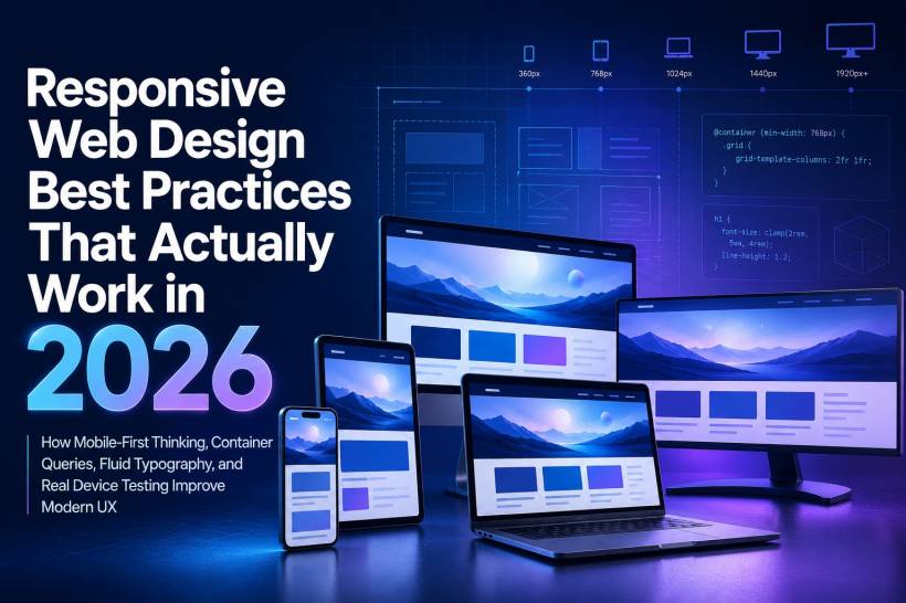
In 2026, responsive design is expected to handle much more. A modern website needs to look good and work properly on a small phone, a tablet, a laptop, a desktop monitor, and even an ultrawide display. Users also switch between devices constantly, so the experience cannot feel like five separate websites stitched together.
The standard today is simple: your website should adapt naturally, load quickly, remain easy to use, and help users complete their task regardless of screen size. That means modern responsive design is not only a layout issue. It is also about performance, accessibility, usability, content priority, and how people actually behave online.
Mobile-First Is Still Important, But It Is No Longer Enough
Mobile-first design remains a strong starting point. The idea is straightforward: design for the smallest screen first, then progressively enhance the layout as more space becomes available.
This approach forces discipline. On a small screen, there is no room for unnecessary clutter. You have to decide what matters most. The content, buttons, forms, images, and navigation all need to earn their place.
That said, responsive design in 2026 needs to go beyond mobile-first. A better mindset is context-first.
A person using a phone is not always in a hurry, and a person using a desktop is not always doing deep research. But screen size often gives clues about the situation. Someone checking a delivery update, flight time, appointment detail, or bank transaction on a phone usually wants speed and clarity. Someone browsing on a larger screen may be comparing options, reading longer content, or using multiple tools at once.
So the goal is not simply to make the same interface fit different screens. The goal is to understand what the user is likely trying to do in that moment and make the experience fit that situation.
Container Queries Make Components Smarter
For many years, responsive design relied heavily on viewport-based media queries. These are still useful, but they have one major weakness: they respond to the browser width, not the space available to a specific component.
That becomes a problem in modern layouts.
For example, imagine a product card. In one part of the website, that card may appear inside a narrow sidebar. In another section, the same card may appear inside a wide homepage feature area. If the browser width is the same, a traditional media query treats both cards the same, even though the available space around each card is very different.
Container queries solve this issue by allowing a component to respond to the size of its parent container. This means a card, banner, module, or content block can change its layout depending on how much space it actually has.
This is a big shift. Instead of thinking only at the page level, developers can now think at the component level. That fits much better with modern design systems, where websites are built using reusable components.
A card can become horizontal when it has enough space. A feature box can switch layouts when placed in a wider column. A navigation block can adjust based on its own container instead of waiting for the full viewport to cross a breakpoint.
In short, container queries make responsive design more flexible and more realistic.
Fluid Typography Creates A Smoother Experience
One of the older problems in responsive design is typography that jumps suddenly between breakpoints. The heading is one size on mobile, then suddenly becomes much larger at tablet width, then jumps again on desktop.
That kind of behaviour works, but it does not always feel smooth.
This is where fluid typography becomes useful. With CSS functions like clamp(), text can scale gradually between a minimum and maximum size. Instead of setting separate font sizes for every breakpoint, you can define a flexible range.
For example, a heading can stay readable on a small phone while growing naturally on larger screens. The same method can also be used for spacing, padding, margins, and layout gaps.
This makes the entire page feel more polished because elements scale smoothly instead of snapping awkwardly from one size to another.
The benefit is not only visual. Good fluid typography also improves readability. A heading that is too large on mobile wastes space. A heading that is too small on a large monitor looks weak. Fluid sizing helps maintain balance across many screen sizes without needing endless CSS overrides.
CSS Grid Is Now A Core Responsive Layout Tool
CSS Grid has become one of the most practical tools for responsive layouts. While Flexbox is still excellent for one-dimensional layouts, such as navigation bars, button groups, and tag lists, Grid is stronger for two-dimensional layouts.
One of the best things about CSS Grid is that it can create responsive layouts without relying heavily on media queries.
Using functions like auto-fit, auto-fill, and minmax(), a grid can automatically adjust the number of columns based on the available space. On a small screen, the layout may become one column. On a tablet, it may become two. On a desktop, it may expand to three or four. On an ultrawide monitor, it may fit even more, depending on the design.
This is a more natural way to build layouts because the content and available space determine the structure. You are no longer forcing the design into fixed breakpoints like 768px, 1024px, and 1440px just because those numbers are common.
For blog grids, product listings, service cards, gallery layouts, dashboards, and feature sections, CSS Grid is often the cleaner and more future-proof option.
The Best Responsive Design Uses Several Techniques Together
There is no single magic technique that solves every responsive design challenge. The best websites use a layered approach.
Media queries are still useful for major layout changes, such as moving a sidebar below the main content on smaller screens or changing a desktop navigation into a mobile menu.
Container queries are better for component-level changes, especially when the same component appears in different layout contexts.
Fluid sizing with clamp() works well for typography, spacing, and visual rhythm across screen sizes.
CSS Grid is excellent for page structure and responsive content layouts.
Flexbox remains useful for smaller layout patterns where content flows in one direction.
This layered approach is what makes modern responsive design more mature. Instead of relying on one technique everywhere, the right tool is used for the right problem.
Touch Targets Cannot Be An Afterthought
A design that works with a mouse does not automatically work with a finger.
On desktop, users can click tiny links and small icons with reasonable accuracy. On mobile, those same elements can become frustrating. If buttons are too small or too close together, users may tap the wrong thing or give up entirely.
In 2026, good responsive design must consider touch targets from the beginning. Interactive elements should be large enough to tap comfortably. Apple recommends touch targets around 44 by 44 pixels, while Google commonly recommends around 48 by 48 pixels.
This does not mean every button must look huge. Developers can use padding to increase the clickable area without making the visual design feel oversized. The important thing is that the tap area is forgiving enough for real human fingers.
This is especially important for menus, form controls, search icons, close buttons, carousel arrows, pagination, and call-to-action buttons.
Performance Is Part Of Responsive Design
A website can look responsive and still feel terrible if it loads slowly.
Performance is now part of the responsive design conversation because mobile users often deal with slower networks, weaker devices, limited battery, and less stable connections. A layout that looks beautiful on a high-end desktop can become painful on a mid-range phone if images are too large, scripts are heavy, or layout shifts keep happening while the page loads.
Responsive images are essential. Developers should use srcset and sizes so browsers can choose the right image size for the device and layout. There is no reason to send a massive desktop image to a small mobile screen.
Important visual elements should be prioritised properly, especially the Largest Contentful Paint element. Setting fetchpriority="high" on the main above-the-fold image can help the browser load the most important content earlier.
Images should also include explicit width and height attributes to reduce layout shift. This prevents the page from jumping around as images load, which is especially annoying on mobile.
A responsive website should not only resize. It should feel fast and stable.
Real Device Testing Still Matters
Browser DevTools are useful. They make it easy to simulate different screen sizes, inspect layouts, and quickly identify obvious issues. But they are not enough.
Device emulation cannot fully reproduce the feel of a real phone. It does not perfectly reflect touch behaviour, screen brightness, font rendering, hardware performance, browser quirks, or real network conditions.
This is why real device testing still matters. At minimum, websites should be tested on actual mobile devices, including mid-range Android phones. These devices represent a large portion of real-world users, but they are often under-tested because developers usually work on powerful laptops and flagship phones.
Testing on real devices helps reveal issues that are easy to miss, such as sticky headers taking up too much space, buttons being hard to tap, animations feeling sluggish, forms being awkward to complete, or images loading too slowly.
A website that performs well only in a desktop browser simulator is not truly responsive. It is only theoretically responsive.
Accessibility Should Be Built Into Responsive Design
Responsive design and accessibility are closely connected.
When layouts change across devices, the experience must remain understandable and usable. Text should stay readable. Buttons should remain reachable. Forms should not become cramped. Focus states should still be visible. Navigation should be usable with keyboard and assistive technologies.
Zooming should not break the layout. Users who increase font sizes should not be punished with overlapping text or hidden controls. Colour contrast must remain strong across all layouts, especially when text appears over images or gradients.
A responsive design that only focuses on visual resizing misses the bigger point. The website should adapt to people, not just devices.
Avoid Designing Only Around Popular Breakpoints
Many teams still design around a few familiar breakpoints: mobile, tablet, desktop, and maybe large desktop. That can be useful for planning, but it should not become a rigid mindset.
There are too many screen sizes now. Foldable phones, tablets, compact laptops, large monitors, split-screen windows, browser sidebars, and ultrawide displays all create different layout conditions.
Instead of designing only for specific breakpoints, it is better to design flexible systems. Use content-based breakpoints when needed. Let components adapt based on available space. Allow grids to reflow naturally. Let typography scale fluidly.
The modern web is not fixed. Your layout should not be either.
Final Thoughts
Responsive web design in 2026 is no longer just a technical checklist. It is a basic requirement for usability, SEO, accessibility, and overall user trust.
Mobile-first thinking is still valuable, but context-first thinking is even better. Container queries help components respond intelligently. clamp() makes typography and spacing feel smoother. CSS Grid creates layouts that adapt naturally. Touch targets, performance, accessibility, and real device testing make sure the experience works in the real world.
The tools are better now. The expectations are higher too.
A good responsive website should not feel like a desktop site squeezed into a phone or a mobile site stretched across a monitor. It should feel natural everywhere, because the structure, content, layout, and performance have all been designed to adapt together.


Comments