

A website can have excellent content and still frustrate visitors. That sounds unfair, but it happens all the time. The articles are well written, the product pages are useful, the contact details are there, and the support information exists somewhere. Yet users still leave because they cannot find what they came for.
That is where information architecture comes in.
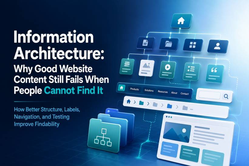
Information architecture, often shortened to IA, is the way a website organises, structures, labels, and connects its content. It is not just about menus or sitemaps. It is about helping people move through a website naturally, without needing to stop and think too hard about where something might be hidden.
When IA is done well, users barely notice it. They click, browse, scan, and find what they need. When IA is done badly, users feel lost. Worse, many of them blame themselves instead of the website. They assume they missed something, typed the wrong search term, or misunderstood the menu. In reality, the structure has failed them.
Good Information Architecture Starts With Findability
The main goal of information architecture is simple: people should be able to find what they need.
That may sound obvious, but many websites are still built around internal company logic rather than user behaviour. A business may organise content based on departments, product ownership, internal terminology, or management preference. Unfortunately, visitors do not care how the organisation is structured. They only care whether the website makes sense to them.
Good IA helps users locate information through browsing, navigation, links, search, and page relationships. Ideally, users should not need to rely on search for everything. Search is useful, but it should not become a rescue tool for a broken structure.
A strong website gives users several ways to succeed. If they browse through the menu, they should find the right section. If they use search, the results should be relevant. If they land on a page from Google, contextual links should guide them to related content. Everything should work together.
Labels Matter More Than Many People Realise
One of the most common IA problems is poor labelling.
Users do not read websites like manuals. They scan. They look at headings, buttons, menu items, and short labels. If those labels are vague, clever, or too internally focused, users become unsure where to click.
For example, a menu item like "Products" is usually clear. People know what to expect. But a label like "Solutions" can be vague unless the context is very obvious. Does it mean products? Services? Case studies? Industry packages? Consultancy? Software? The user has to guess.
The same problem happens with words like "Resources," "Offerings," "Assets," or "Platforms." These terms may sound professional in a boardroom, but they often fail normal users because they do not clearly describe what is behind the link.
Good labels use the user's language. If users call something "pricing," do not hide it under "commercial options." If they expect "Support," do not rename it "Help Centre" in one place and "Customer Care" in another unless there is a clear difference.
Consistency builds confidence. Confusing labels create hesitation.
Too Many Clicks Can Kill The Journey
Another common problem is depth. Every extra click adds friction.
A website does not need to place everything on the homepage, of course. That would create a messy and overwhelming experience. But important content should not be buried five or six levels deep either.
A practical rule is that important pages should usually be reachable within two to three clicks from the homepage. If a page requires more than that, there should be a strong reason for it. Otherwise, users may give up before reaching it.
This is especially true for frequently needed information such as contact details, pricing, service explanations, documentation, appointment booking, application forms, support channels, or product comparisons.
The deeper the content goes, the more confident the structure needs to be. If the hierarchy is logical, users may continue clicking because each step feels correct. But if the labels are unclear, every click feels like a gamble.
Navigation Should Be Prioritised, Not Politicised
Many websites suffer from the "everything is important" problem.
Every department wants its page in the main navigation. Marketing wants campaigns there. Sales wants product categories there. HR wants careers there. Support wants help pages there. Management wants corporate information there. Before long, the navigation bar has too many items, and users cannot quickly understand what matters.
Good navigation requires prioritisation. The main menu should not become a dumping ground for every internal request. It should represent the primary paths users need most.
For most websites, global navigation should be limited to around five to seven main items. That keeps the structure easier to scan and remember. Secondary content can still exist, but it can be placed in submenus, footer navigation, contextual links, or internal search.
A clean navigation system is not about hiding content. It is about putting content in the right place.
Card Sorting Helps You Understand How Users Think
One of the best ways to improve IA is card sorting.
Card sorting is a research method where users are given a set of content topics and asked to group them in a way that makes sense to them. This can be done using physical cards or digital tools.
The value of card sorting is that it reveals how users naturally organise information. Sometimes the results confirm what the website team already expected. Other times, it exposes a major gap between the company's internal structure and the user's mental model.
There are two common types of card sorting. Open sorting lets users create their own categories and names. This is useful when you are still exploring how content should be grouped. Closed sorting gives users predefined categories and asks them to place content into those groups. This is useful when you already have a proposed structure and want to test whether it makes sense.
For websites with many services, articles, products, forms, or support pages, card sorting can prevent a lot of future confusion.
Tree Testing Shows Whether The Structure Actually Works
If card sorting helps you understand how users group content, tree testing helps you validate whether they can find things inside your proposed structure.
Tree testing removes visual design from the equation. Users are shown a simple text-based hierarchy, such as Home, Products, Software, Downloads, and so on. They are then asked where they would go to complete a task.
This is powerful because it tests the structure before the website design distracts everyone. If users cannot find something in a plain text hierarchy, a beautiful interface will not magically fix the problem.
Tree testing is especially useful before redesigning a website. It allows teams to identify weak labels, confusing groupings, unnecessary depth, and misplaced content before development begins.
In simple terms, fix the structure first. Then make it look good.
Different Types Of Navigation Serve Different Purposes
A good website usually needs more than one type of navigation.
Global navigation appears across the whole website and gives access to the main sections. This is the main menu most users depend on.
Local navigation appears within a section and helps users move between related pages. For example, a service page may have local navigation for overview, pricing, features, FAQs, and contact options.
Contextual navigation appears inside the content itself. This includes related article links, product recommendations, "learn more" links, or supporting documentation. It helps users continue exploring without returning to the main menu.
Utility navigation usually includes items like search, login, account, cart, help, or contact. Users often expect these items at the top right of a website, so moving them somewhere unusual can create unnecessary confusion.
Breadcrumbs are also useful, especially for deeper websites. They show users where they are within the hierarchy and allow them to move back up easily. For large sites, breadcrumbs can reduce frustration and give users a stronger sense of place.
Footer navigation should not be treated as an afterthought either. Many users scroll to the footer when they cannot find something in the main navigation. A well-organised footer can save the user journey.
Mobile Information Architecture Needs Its Own Thinking
Mobile IA is not just desktop IA squeezed into a smaller screen.
On mobile, users have less space, less patience, and often more distractions. They may be browsing while walking, waiting, commuting, or multitasking. This changes how navigation should work.
Hamburger menus are common because they keep the screen clean, but they also hide navigation. If users never open the menu, they may never discover important sections. For critical actions, visible shortcuts may work better.
Bottom navigation can be helpful for mobile experiences because it places key actions within thumb reach. This is why many mobile apps use bottom tabs for their most important destinations. However, it should be limited to a small number of items, usually around three to five.
Progressive disclosure is also important. Instead of showing every submenu at once, the interface can reveal deeper options only when the user selects a category. This keeps the experience cleaner and reduces mental overload.
Search also becomes more important on mobile. Many mobile users prefer to search directly instead of navigating through multiple menus. If the search function is weak, the mobile experience will suffer.
Every Page Should Have A Logical Home
A surprisingly common problem is the orphaned page.
This happens when a page exists, but no proper link leads to it. Users can only find it through search, a direct URL, or an external link. That is risky because if users do not know the right search term, the page may as well not exist.
Every important page should be reachable through the website's browse structure. If a page cannot be placed logically anywhere, that is a sign of a deeper issue. Either the page does not belong, or the website structure needs to be revised.
Content should not float around disconnected from the rest of the site. It should have a place, a purpose, and a path.
Testing Should Guide The Structure
Information architecture should not be designed purely by intuition. The people building the website usually know too much. They understand the business, the departments, the product names, and the internal logic. Users do not have that context.
That is why testing matters.
Findability testing asks users to locate specific content using navigation only. First-click testing checks where users click first when given a task. A/B testing can compare different labels to see which one performs better. Reverse card sorting can validate whether existing groupings make sense to users.
These methods do not need to be overly complicated. Even small tests with a handful of users can reveal major problems. The goal is not to make IA perfect overnight. The goal is to reduce guesswork and make decisions based on real user behaviour.
Sitemaps And Content Inventories Keep Things Under Control
A sitemap is useful because it shows the hierarchy of pages. It helps stakeholders, designers, developers, and content teams understand how everything connects.
But a sitemap alone does not prove that users can find things. It shows the intended structure, not the actual user experience. That is why it should be combined with testing.
A content inventory is also important, especially for larger websites. It lists each page, its purpose, audience, location, owner, status, and sometimes performance data. Without a content inventory, it becomes difficult to know what exists, what is outdated, what is duplicated, and what needs to be removed.
A controlled vocabulary can also help. This means defining the approved terms used across labels, metadata, search, and content. If one part of the site says "doctor," another says "physician," and another says "clinician," the experience may become inconsistent unless there is a clear reason.
Good IA is not only about launching a clean structure. It is also about maintaining it.
Final Thoughts
Information architecture is one of those things users only notice when it fails.
When it works, the website feels easy. Users move naturally from one section to another. They find what they need, complete their task, and leave with confidence. When it fails, users feel lost, search becomes a crutch, and good content goes unseen.
The biggest mistake is assuming that your organisation's view of the content is the same as your users' view. It usually is not. That gap is exactly where poor findability begins.
Good IA starts with user research, clear labels, sensible grouping, shallow enough navigation, and regular testing. Design and visuals still matter, but they cannot save a structure that does not make sense.
In the end, the best navigation is the one users do not have to think about.


Comments