

Vintage typography never really disappears. It just keeps finding new ways to come back. One year it shows up in logo design, then it moves into packaging, poster work, apparel graphics, café branding, social media templates, and event visuals. That is part of the reason retro-inspired fonts remain such a useful resource for designers. They can instantly give a project personality, warmth, and a sense of time and place.
The appeal is easy to understand. A vintage font can make a design feel playful, elegant, rebellious, handcrafted, or nostalgic, depending on the era it draws from. Some carry the bold swagger of 1970s advertising. Others lean into mid-century refinement, psychedelic curves, or decorative old-school flair. The right one can completely change the tone of a project before a viewer has even started reading.
That is why it makes sense to keep a small collection of reliable vintage fonts in your toolbox. You may not use them every day, but when the right project comes along, having a few strong retro choices ready can save time and spark better ideas.
Why Vintage Fonts Still Matter
Retro typefaces do more than imitate old design trends. They help create mood. A font choice can suggest a whole visual world, whether that means a 1960s music poster, a classic diner menu, a handcrafted product label, or a boutique editorial layout with old-world character.
This is especially valuable in branding and promotional work, where first impressions matter. A generic font might get the message across, but a well-chosen vintage one can make the message feel more memorable. It adds texture and identity without needing a lot of extra decoration.
Of course, not every project needs that sort of treatment. But when a design calls for charm, nostalgia, or a little extra visual personality, vintage fonts are often one of the quickest ways to get there.
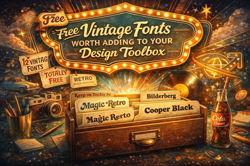
A Few Free Vintage Fonts That Stand Out
If you are building your collection, there are several retro-style fonts worth looking at. Each one brings a different flavour, so the best choice depends on the kind of design mood you are trying to create.
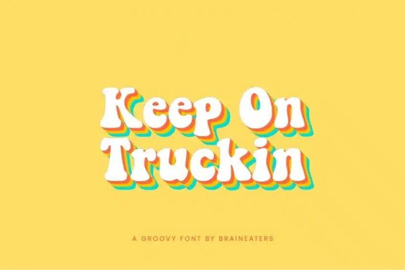
Keep on Truckin' FW
This is one of those fonts that immediately feels tied to the free-spirited energy of the 1960s. Its rounded, bouncy letterforms have a distinctly groovy personality, and it is easy to see why it has remained popular over the years. It has that cheerful, slightly exaggerated style that works beautifully when a design needs fun rather than restraint.
It is especially well suited to music-related graphics, festival posters, playful branding, and anything that benefits from a sunny, nostalgic tone. If a project needs a dose of flower-power energy, this font delivers it quickly.
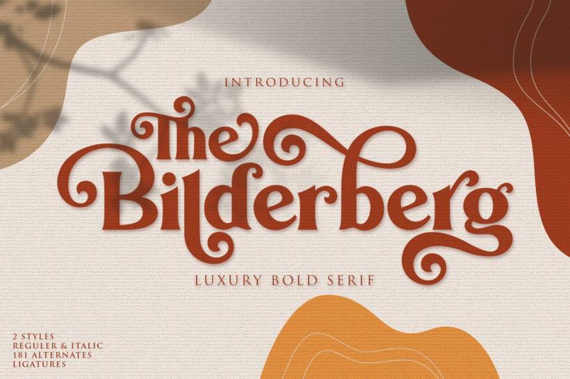
Bilderberg
Bilderberg takes things in a more refined direction. Instead of leaning hard into exaggerated retro fun, it brings a classic serif look with a polished, mid-century feel. It is the kind of font that can add elegance without becoming overly formal.
This makes it useful for headline work, editorial layouts, stylish branding, and projects where you want a vintage influence but not something too loud. It feels more tailored and sophisticated, which gives it versatility across a wider range of design styles.
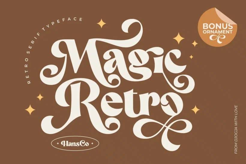
Magic Retro
Magic Retro is a more decorative option, and that is exactly what makes it appealing. It embraces the vintage look with confidence, offering a playful and fashionable retro feel that works especially well for logos, packaging, and invitations.
One of its strengths is that it often comes with extra stylistic options such as swashes and slanted variations, which can help a design feel more custom and expressive. Fonts like this are useful when you want the typography to do more of the visual storytelling.
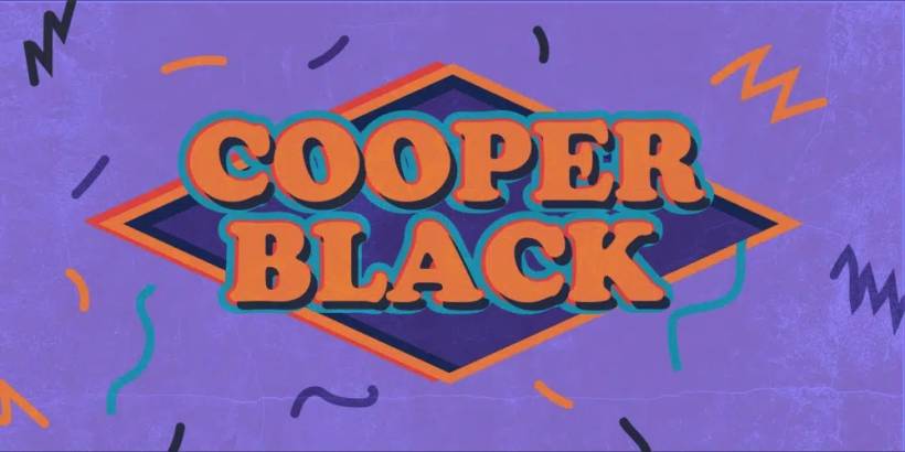
Cooper Black and Similar Bold Retro Styles
Cooper Black is one of those legendary typefaces that instantly brings to mind vintage advertising, old magazine covers, and classic pop-art-inspired design. It is heavy, friendly, bold, and packed with personality. Even people who do not know its name tend to recognise the overall style.
It works particularly well for headlines, posters, branding, and any layout that needs to feel loud and confident. If the goal is to make text feel cheerful and unmistakably retro, this style is hard to ignore.
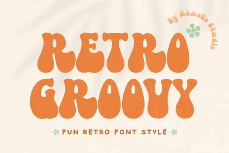
Retro Groovy and Similar Alternatives
For projects that want a strong 1970s vibe, rounded groovy fonts remain a popular choice. These are the kinds of typefaces that feel made for disco-inspired visuals, fun event branding, statement posters, and anything that benefits from exaggerated curves and carefree energy.
Even when a specific font is not fully free for commercial use, there are often similar alternatives that deliver a comparable mood. This is common in the font world, where one style becomes iconic and then inspires many lookalikes.
What Actually Makes a Font Feel Vintage
Not every old-looking typeface automatically feels authentic or useful. Vintage fonts usually share certain visual traits that connect them to specific design eras.
Some rely on ornate serifs and decorative flourishes. Others use heavy weights that feel bold and commanding. A few include roughened textures or distressed details that mimic age and wear. Many draw directly from recognizable historical periods, whether that means Art Deco geometry, rockabilly flair, psychedelic curves, or neon-inspired styling.
That is why choosing a vintage font is not just about picking something old-fashioned. It is about deciding which era or visual culture best supports the design you are creating.
A retro food label, for example, may need something very different from a 1970s-style concert flyer or a mid-century luxury brand identity. The word vintage covers a lot of territory.
How to Use Vintage Fonts Without Overdoing It
Vintage typefaces are full of character, which is great, but that also means they can take over a layout very quickly. In most cases, it is better to let them lead rather than compete with too many other decorative elements.
A bold retro headline often works best when paired with a simpler supporting font for body text. That contrast helps the design stay readable and keeps the vintage type from becoming overwhelming. If everything on the page is shouting for attention, the overall design starts to feel confused.
It is also important to test vintage fonts at the actual size you plan to use. Some look fantastic in large display settings but become difficult to read at smaller sizes. Others may seem exciting in a font preview but lose their impact once placed into a real design layout.
The smartest approach is usually a restrained one. Let the font provide the atmosphere, then build the rest of the design around it more quietly.
Always Check the License Carefully
One of the biggest traps with free fonts is assuming that free to download means free for anything. It often does not. Many fonts are perfectly fine for personal projects but require a separate license for logos, packaging, client work, merchandise, or anything commercial.
That is why licensing matters just as much as visual style. Before using any font in professional work, it is worth checking the terms directly from the creator or distributor. A beautiful typeface can become a headache very quickly if the usage rights are unclear.
This is especially true with retro and novelty-style fonts, where versions, imitations, and trial files can circulate widely online with inconsistent licensing notes attached.
Building a Better Font Toolbox
A useful font library is not about collecting hundreds of random typefaces. It is about having a few dependable options that each serve a clear purpose. With vintage fonts, that might mean keeping one groovy display face, one elegant retro serif, one bold old-school headline font, and one decorative script or packaging-style option.
That kind of mix gives you flexibility. You will be able to respond to a wider range of design briefs without scrambling every time a client asks for something nostalgic, classic, or retro-inspired.
And because trends tend to circle back, vintage fonts are rarely a waste of space in a designer's collection. They keep proving their value again and again.
Final Thoughts
Vintage fonts continue to earn their place because they bring immediate mood and visual identity to a design. Whether the look is playful, classy, bold, or nostalgic, the right retro typeface can make a project feel far more distinctive.
Fonts like Keep on Truckin' FW, Bilderberg, Magic Retro, Cooper Black-style options, and other groovy retro faces each offer something different, which is exactly why they are worth exploring. The key is to choose them with intention, use them with restraint, and always pay attention to licensing before putting them into commercial work.
A good vintage font does more than look old. It gives a design character. And that is why having a few strong retro options ready in your toolbox is always a smart move.


Comments 1
This is quite nice font to add to my collections.