search

LEMON BLOG

Why Pure Black Is Usually the Wrong Choice in Design

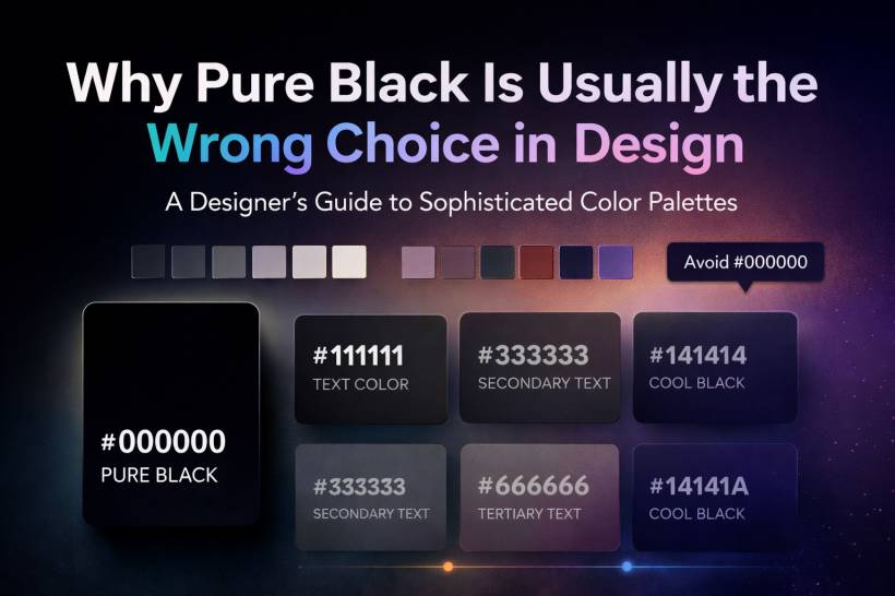
Pure black often feels like the obvious answer in design. It is bold, simple, and always available in every color picker. Because of that, many people treat it as the safest option for text, backgrounds, and interface elements. But in practice, it is often one of the least refined choices you can make. Many of the most polished digital products and premium visual identities do not rely on absolute black at all. Instead, they use softened near-blacks, deep charcoals, and carefully tuned dark grays that feel more natural, more elegant, and easier on the eyes.

Continue reading

Top 5 Tips and Tricks to Master Adobe Illustrator

Adobe Illustrator can feel overwhelming when you first launch it—the endless panels, tools, and options can easily intimidate even creative professionals. But the truth is, once you learn a few essential tricks, Illustrator transforms into a powerhouse for creating logos, illustrations, icons, and even complex vector artwork.

Continue reading

LEMON VIDEO CHANNELS

Step into a world where web design & development, gaming & retro gaming, and guitar covers & shredding collide! Whether you're looking for expert web development insights, nostalgic arcade action, or electrifying guitar solos, this is the place for you. Now also featuring content on TikTok, we’re bringing creativity, music, and tech straight to your screen. Subscribe and join the ride—because the future is bold, fun, and full of possibilities!

My TikTok Video Collection
Subscribe to our Blog
Get notified when there's new article
Subscribe