

If you design packaging long enough, you start to notice a pattern: the "must include" list never gets shorter. Nutrition panels, ingredients, allergen callouts, warning statements, recycling marks, barcodes, batch codes, expiry dates, and now even more traceability and material data. In the US, the FDA has been moving toward expanded front-of-pack disclosures for things like saturated fat, sodium, and added sugars. In the EU, the Packaging and Packaging Waste Regulation (PPWR) is set to take effect in August 2026, and it pushes packaging toward more detailed material composition info, recycled content percentages, and clearer producer identification.
Designers often experience all of this as one big vibe-killer. It can feel like regulations are showing up late to a perfectly composed layout and shouting, "Make room for my paragraph." But there's another way to look at it. The best brands treat mandatory information as part of the experience. Not as a messy compromise, but as a chance to show clarity, honesty, and trust.
The Real World of Mandatory Copy
Before you can "make it beautiful," you have to understand what you're actually dealing with. Legally required content usually covers:
• Ingredient lists and allergens
• Nutrition panels and claims rules
• Warnings and hazard statements
• Directions for use
• Traceability data like batch/lot codes and expiry dates
• Barcodes and other machine-readable requirements
None of these are "nice to have." Each is tied to specific regulatory frameworks, such as US food labeling rules (like 21 CFR 101), EU food information rules (EU FIC), plus country-by-country variations that can change how copy is written, sized, placed, or translated.
And the risk isn't theoretical. Allergen mistakes are among the most common triggers for recalls. Unsupported marketing claims can bring enforcement action. And with newer traceability requirements, packaging increasingly needs identifiers that make each product easier to track through the supply chain.
In short: compliance isn't decoration. It's operational.
The Mindset Shift: Compliance Copy as Trust-Building
The brands that handle this well don't treat regulatory text like unwanted clutter. They treat it like proof.
Proof that the brand isn't hiding anything.
Proof that the company respects the consumer enough to be clear.
When you frame it like that, design becomes less about "where do I hide this" and more about "how do I present this so it's readable, confident, and on-brand."
Brands That Turn Mandatory Text Into Design
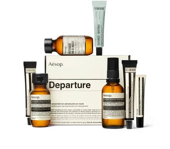
Aesop: Minimal, But Not Empty
Aesop is famous for its stripped-back packaging: simple bottles, clinical typography, and lots of breathing room. Yet their labels still carry dense ingredient lists and multi-language requirements.
What makes it work is that the regulatory content doesn't feel like an awkward add-on. The typography choices are consistent with the brand voice. Spacing, alignment, and rhythm are handled with care. Dense text becomes texture, and it looks intentional instead of apologetic.
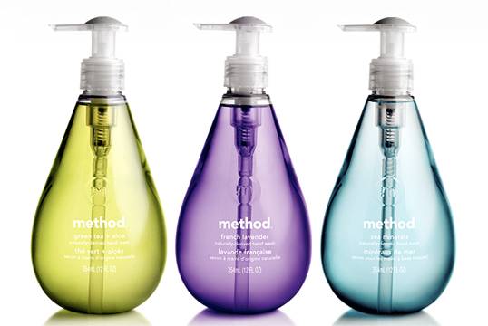
Method: Bright Packaging With Clear Structure
Method products are bold and colorful, and that could easily become chaotic once warnings, directions, and required statements pile on.
Their trick is system design. They use clear hierarchy and predictable placement. Different information types are visually separated, and high-contrast warning areas feel like deliberate panels rather than scary sticker-like intrusions. It's compliance that fits the product personality without turning the bottle into a legal document.
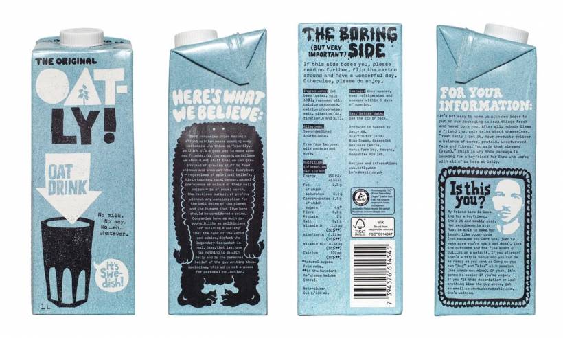
Oatly: Making Legal Copy Sound Like a Human Wrote It
Oatly took a different path: they turned the "boring parts" into brand voice. Their ingredient explanations and disclaimers often read conversational, sometimes playful, but still structured to meet requirements.
That approach usually demands tight collaboration with legal and regulatory teams, because tone cannot compromise accuracy. When done well, though, it makes people actually read what's on the pack, which is a rare win in the compliance world.
When You Simply Run Out of Space
Sometimes good layout isn't enough. Some packages just don't have the real estate, especially when you're dealing with:
• Small containers with long INCI/ingredient lists
• Chemicals with detailed hazard and precautionary statements
• Pharmaceuticals that require patient leaflet-style information
That's where Extended Content Labels (ECLs) come in, like peel-and-read labels, booklets, or concertina folds. They keep the main design clean while expanding legally required content into multi-page formats. Modern options can be more material-efficient than older booklet styles and can be built with sustainability in mind, depending on vendor and specification.
The big idea is simple: protect the primary design while still meeting every requirement.
A Practical Framework for Designers
1. Treat Regulatory Text Like Master Data
Mandatory copy isn't creative writing. It's controlled information. You need a "single source of truth" per SKU and market, with versioning and documentation. If teams freestyle the copy or "fix grammar" without approvals, you can end up with costly mistakes.
2. Design for Scanning, Not Just Reading
Most people don't sit down and read packaging like a novel. They scan.
Good regulatory design supports scanning through:
• Strong typographic hierarchy
• Color logic for different content types
• Icons and symbols (when legally permitted)
The goal is wayfinding. People should find allergens, warnings, or usage info quickly without feeling lost in text.
3. Bring Compliance Into the Layout Early
If regulatory content enters the project at the end, it will always feel disruptive. If it's in the file from day one, you can build grids, spacing rules, and hierarchy around it. That's the difference between "crammed in" and "designed."
4. Build Templates That Can Expand
Markets vary. Languages expand. Some countries demand extra marks or statements. Your design system should anticipate text growth and variant swapping without requiring a total redesign each time.
5. Test Like It's a Product Feature
Barcodes fail if contrast is poor, if they sit on folds, if gloss interferes, or if printing tolerances shift. The same goes for legibility on real materials. Test on actual substrates and production conditions, not just a perfect on-screen mockup.
The Bigger Trend: More Disclosure, Not Less
The direction is pretty clear: packaging is becoming more informational.
Front-of-pack summaries, deeper ingredient disclosures, recycled content communication, traceability, digital product passports, serialization, and sustainability labeling all point to one reality: more required information is coming.
So the real competitive edge is no longer "how little can we show," but "how well can we communicate."
Final Thoughts
Regulatory design will always be a constraint, but it doesn't have to be a compromise. When brands treat compliance content as part of the user experience, the packaging feels more trustworthy, more confident, and frankly more mature.
You probably won't make a nutrition panel "exciting." But you can make it readable, consistent, and visually integrated, and that alone separates thoughtful packaging from the kind that looks like it's trying to hide the fine print.


Comments