

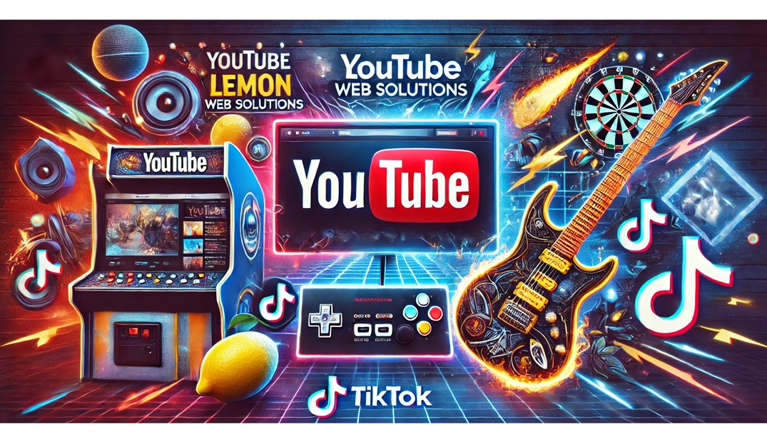
If you've visited my Lemon Blog before, you probably noticed it was functional… but it didn't quite feel "alive". Today's update was all about fixing that. I wanted the blog landing page to look and behave like a proper modern content hub: welcoming, clean, and easy to filter without making the layout feel cluttered.
This wasn't a "tiny CSS tweak" kind of update either. It was a full refresh of the top section (hero area) plus a smarter filtering experience depending on how you're browsing the blog.
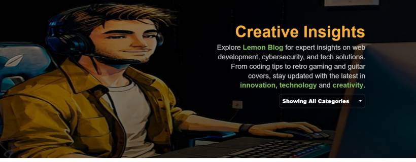
A Real Hero Section (Not Just a Heading)
The biggest change is the new full-width hero section that only appears on the main blog page with no URL parameters.
When you open the blog normally (no ?cat=..., no pagination), you get:
This makes the blog instantly feel more "premium" and brand-driven, instead of looking like a default template. And because autoplay can be fussy on some mobile devices, the page includes a small script that starts playback on the first user interaction (tap/click). So the hero video still feels smooth without breaking browser rules.
A Smarter Rule: Full Hero Only When It Makes Sense
Here's the part that makes the layout feel polished instead of repetitive. The hero is shown only when the URL has no query string at all. In other words:
That matters because once someone is already filtering, paging, or deep browsing, they don't need a giant banner taking space. They need speed and navigation.
So the blog now behaves more like a proper "content index":

Category Filtering: Always Visible, Always Practical
Filtering got upgraded in two different ways depending on the page mode:
On the main blog page
The category selector sits inside the hero area, aligned nicely to the right. It looks like part of the design, not an afterthought.
The dropdown options also use a dark glass look, so it matches the hero's mood instead of showing the default ugly grey list.
Even better, the hover/selected styling uses #7fbe54, so the "Lemon" personality is present without being loud.
On category/pagination pages
This is where the compact version kicks in.
Instead of showing the hero again, the page shows only the dropdown selector at the top-right. That keeps browsing fast and clean, especially when someone is hopping between categories.
This compact selector is also styled differently so it fits the normal page background (not the hero overlay). It stays readable, simple, and doesn't clash with the blog content.
"Showing All Categories" (Because Clarity Beats "All")
Another small change that makes a big difference: the default dropdown label was renamed from a vague "All Categories" to:
Showing All Categories
It seems tiny, but it's clearer. It reads like a current state, not just a button. That helps users understand immediately that the blog is currently unfiltered.
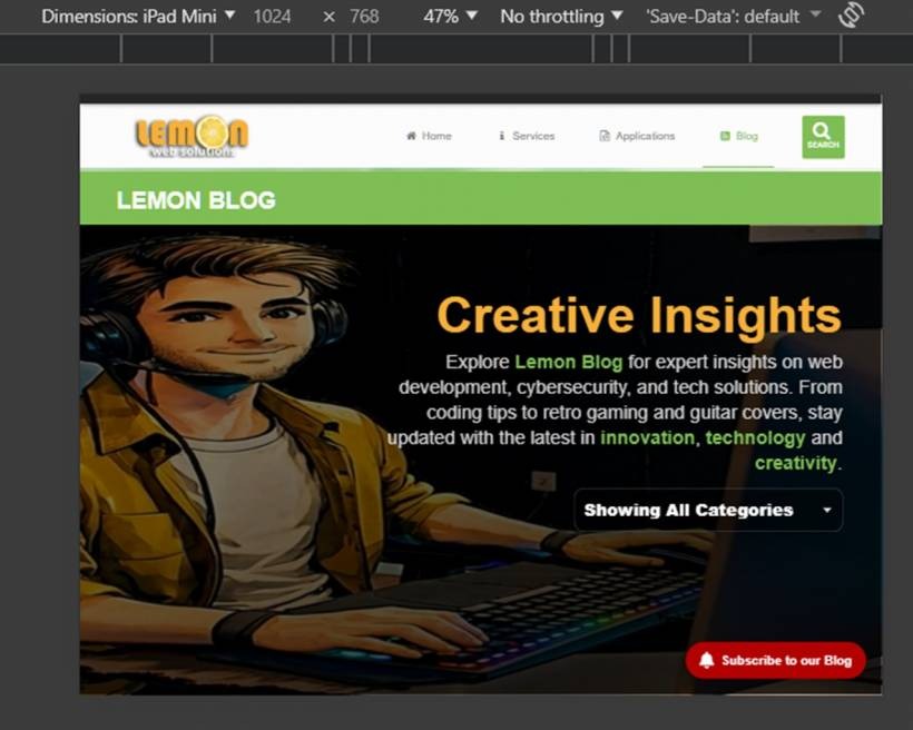
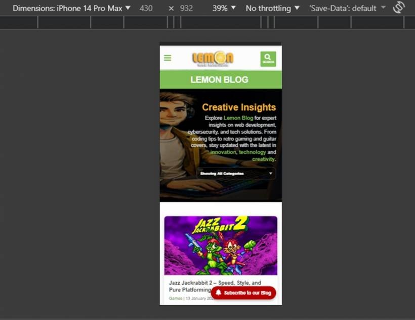
Mobile Tweaks So It Doesn't Break the Experience
A hero banner can look amazing on desktop and look like a disaster on mobile if you don't tame it. So the update also includes responsive tweaks such as:
The goal was simple: keep the "wow" factor without ruining usability.
What Didn't Change (On Purpose)
The blog grid and post cards stayed exactly the same. That was intentional. The article grid already does its job well:
So this update focused on the top experience (hero + filter) without touching the part that already works.
Final Result: A Blog That Feels Like a Brand
After these changes, Lemon Blog doesn't just look like a collection of posts anymore. It feels like an actual destination:
Basically: less "template", more "Lemon".
If you've been reading the blog regularly, you'll probably feel the difference immediately. And if you're visiting for the first time, the page now tells you what the blog is about within the first few seconds — before you even scroll.


Comments