

The impression of a three dimensional cube can be created using modern CSS techniques, without the need for JavaScript, imagery, canvas or SVG. Using the proprietary transform property to skew and rotate shaded rectangles, individual cube faces can combine to form a 3D object. Currently only supported in recent WebKit and Gecko based browsers, most importantly Firefox 3.5+ and Safari 3.2+.
To demonstrate the power of this effect a second experiment with multiple cubes and proprietary WebKit transitions is also available.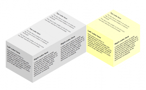
Similar to my previous experiments, the HTML markup is very simple. Each of the faces has its own DIV, class and content. The top face requires some extra markup to aid the transformation, more on that shortly.
<divclass="cube">Create HTML codes first
<divclass="topFace">
<div>
Content
</div>
</div>
<divclass="leftFace">
Content
</div>
<divclass="rightFace">
Content
</div>
</div>
A short disclaimer, the geometry in this example is 'fudged', in that the values have been adjusted to appear roughly correct. I know that the dimensions are slightly out of whack, this is merely to save my head from mathematics and to get the concept out there quickly for people to see. With that said, let's crack on with the CSS.
Each of the three rectangles is given a slightly different shade of gray to give the impression of depth, in this example the left face is in shadow. The faces are each positioned absolutely, relative to the cube container. Each face is 200 x 200 pixels, including 10 pixels of padding.
.cube {and the CSS script for this
position: relative;
top:200px;
}
.rightFace,
.leftFace,
.topFace div {
padding:10px;
width:180px;
height:180px;
}
.rightFace,
.leftFace,
.topFace {
position: absolute;
}
Now for the fun bit. The left and right rectangles are skewed by ±30˚ along the vertical axis, with the right face shifted left by 200px, cleanly lining up the two edges to create a corner that is center aligned.
.leftFace {customizing left and right face
-webkit-transform: skewY(30deg);
-moz-transform: skewY(30deg);
background-color:#ccc;
}
.rightFace {
-webkit-transform: skewY(-30deg);
-moz-transform: skewY(-30deg);
background-color:#ddd;
left:200px;
}
The top face proves more problematic; it needs to be skewed, scaled, rotated and positioned. The skew is the same, –30˚ along the vertical axis, this skewed rectangle must then be rotated clockwise by 60˚. Rotating the rectangle itself leads to a change in orientation of its content, a container must be added and then rotated.
A simple way of creating a top face without resorting to maths is to duplicate the left and right rectangles, skew them in the opposite directions (by inverting the sign, e.g. left face is now skewed by –30˚) and position them against the existing faces to create a diamond shape between the two sets. Now use positioning and scaling to fill this diamond and form the top face, deleting the duplicates when finished. My results led to a scaling factor of 1.16 in the Y direction which I have accounted for by reducing the font-size by the same factor.
.topFace div {adding topface styling for the cube
-webkit-transform: skewY(-30deg) scaleY(1.16);
-moz-transform: skewY(-30deg) scaleY(1.16);
background-color:#eee;
font-size:0.862em;
}
.topFace {
-webkit-transform: rotate(60deg);
-moz-transform: rotate(60deg);
top:-158px;
left:100px;
}
and that its. its done. Try it yourself. View the demo here.


Comments