

When building a website or designing a UI, we often get tangled up in the small details that control how elements are spaced. Four of the most commonly misunderstood CSS properties are gap, margin, line-height, and padding. At first glance, they all seem to "add space." But in reality, they do so in very different ways, and knowing how each works can make your designs look polished instead of messy. Let's break them down in a practical, easy-to-follow way with examples.
1. Gap – The Team Player in Flexbox and Grid
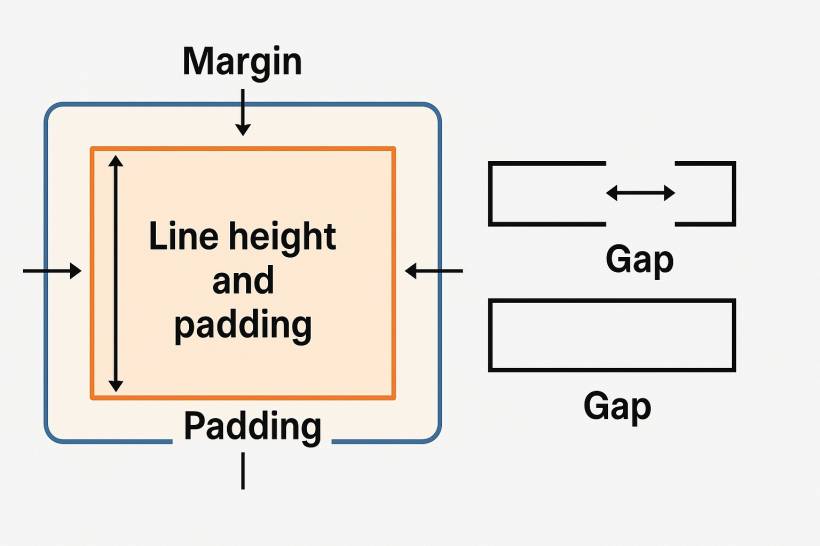
Think of gap as the "space between siblings" in a family. It doesn't care about the content inside or the space outside; it only makes sure siblings in a flex or grid layout don't bump into each other.
For example:
display: flex;
gap: 20px;
}
Here, every direct child of .container will have 20px spacing between them. You don't need to add margins to each child anymore (which used to be the old-school method).
When to use gap:
2. Margin – The Personal Bubble
Margin is like the personal space around an element. It pushes the element away from its neighbors, but it doesn't affect what's inside the box.
For example:
margin: 15px;
}
This adds a 15px buffer zone around the card—above, below, left, and right. Unlike padding, it doesn't create extra room inside the card; it just moves the card away from others.
When to use margin:
3. Line Height – Breathing Space Between Text Lines
Now, let's talk text. Line-height doesn't add space around boxes—it affects the vertical spacing inside text lines.
For example:
font-size: 16px;
line-height: 24px;
}
Here, each line of text has 24px total space (including the characters and the gap above/below them). This makes text easier to read. Without a good line-height, text looks squished.
When to use line-height:
Tip: A safe rule of thumb is 1.4–1.6 times the font size. So, if the font size is 16px, a line-height of 22–26px usually works well.
4. Padding – The Inner Cushion
Finally, padding is the space between the content and the border of an element. Imagine padding as the cushion inside a box that keeps the content from touching the edges.
For example:
padding: 10px 20px;
}
This adds 10px of space above and below the text, and 20px left and right. The button now feels more clickable because the text has breathing room.
When to use padding:
Putting It All Together – A Real-World Example
Let's say you're creating a simple card layout:
margin: 20px; /* Space outside card */
padding: 15px; /* Space inside card */
line-height: 1.5; /* Readable text spacing */
}
.container {
display: flex;
gap: 30px; /* Space between cards */
}
When combined correctly, these four properties create a balanced, professional-looking layout without overcrowding or awkward empty spaces.
Final Thoughts
Gap, margin, line-height, and padding may all deal with "space," but they each play different roles. Gap handles relationships between siblings, margin defines external space, line-height manages text readability, and padding cushions content inside its box.
Mastering these differences is like learning the difference between seasoning, sauce, and cooking oil in a recipe. Each has a role, and using the right one in the right place can make your design chef's kiss perfect.


Comments